I attended the event with a degree of trepidation – leaving home in the early morning for a 2.5 hour drive in far from perfect weather conditions and with the prospect of further driving over the next day didn’t fill me with enthusiasm. However, the event was well worth the effort. Good to meet some fellow students and tutors with an opportunity to voice a few opinions.
Meeting at the Markeaton campus on a university open day probably wasn’t the best of ideas, but we made the best of it and had some good discussion about our first five photographers:
RJ Fernandez was the first we considered.
His images of the effects of gold mining in the Philippines in his exhibition ‘Moving Mountains’ where the landscape has been completely changed, rivers polluted and the indigenous people displaced had some very powerful images. The scale of the operations was shown by the inclusion of trucks / buildings / people. A surprising image of a model of the workings caused some discussion. I liked the simple light wood framing of these images – enough to draw the attention to the pictures, but not enough to detract from them.
We then looked at three photographers concentrating on the work place:
Daniele Cinciripini’s display entitled ‘Ten Minutes’ showed various images of workers during their strictly monitored 10 minutes’ break. Interesting to see that there was no interaction between any of the workers, even when in a group the individual members weren’t talking to each other. To me it seemed to be a strange way to work – the workers obviously didn’t enjoy being there, so the likelihood would be that they were not performing to potential.
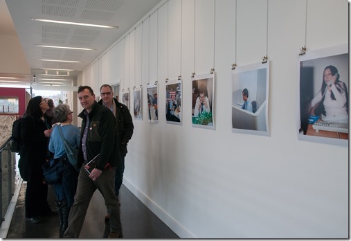
Also in the office location we saw Louis Quail’s display ‘The Desk Job’, showing how individuals had adorned their individual desk spaces – not a trait I particularly applaud – soft toys were on top of computers and cups of tea were evident around keyboards etc. It made the workplace look slipshod. It was another display of people not looking happy in their work! It was interesting to see the mounting of this display, where simple square prints were held up by bulldog clips. I could see the idea to have them mounted as though they were on the office noticeboard, but for me it looked shoddy and detracted from the quality of the photographs.
Christopher Steel took images in a similar vein, but without people. These images were of notices / milk cartons etc. where the workers were being so controlling over their small possessions / workspaces and had edicts to control their behavior, so again this was an indication of the low value placed on staff by the management. Although this was very minimalist, it created a great deal of discussion. They were obviously very effective photographs.
In contrast to the previous three photographers, Sandra Hoyn’s ‘Poisonous Business’ portrayed the poor working practices and pollution caused by some of India’s leather production business. These images were obviously taken to promote the suffering caused to children working there. After discussing the merits of the photographs, the question was asked ‘Does it make you want to go and do something about their plight?’ The general consensus was that we’ve become immune to this type of image – there’s too much of it every day in so many places that a new way of bringing attention to it is needed. Maybe it’s time to move on to another way. I liked the way these images were mounted – large scale images laminated onto board with no frames. This works well for many presentations.
We then changed location to ‘Deda’ where we studied the work of Moira Lovell in her exhibition ‘We Will Stand’
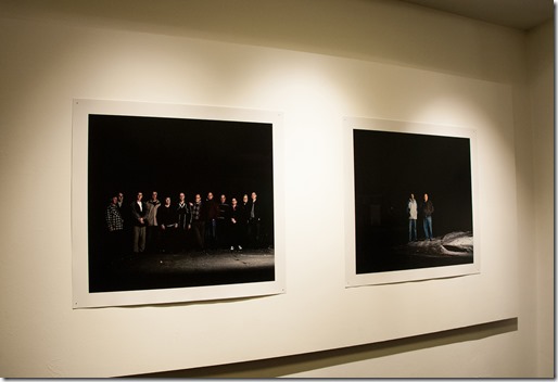
Here she revisited the locations of the 1980’s miners’ strikes and using primarily single light sources, she captured staged images of ex-workers to produce high contrast, high impact images where the subjects stand out against an almost black background. Excellent, powerful images which I felt were let down by their mounting – again it was high quality printing, but the prints were pinned to the wall with no framing other than the surround of the print – the presentation looked unfinished to me.
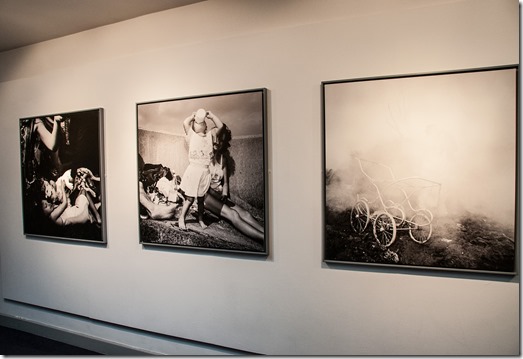
Also at Deda we looked at Ken Grant’s exhibition ‘No Pain Whatsoever’
His documentary photography around Liverpool in the 1980’s has a remarkably intimate and emotional quality. Seeing the level at which some people were living – scavenging the rubbish tips for anything which could be saleable, but still enjoying family life – make you appreciate the social injustice of the time.
The presentation of the display was excellent too. Using large scale black and white prints, laminated onto a thick substrate, then surrounded by a thin grey frame, made the images really ‘shout’.
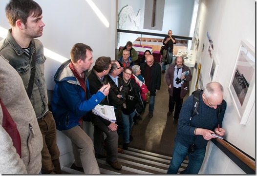
After lunch we met at QUAD where we looked at Caroline McNally’s display ‘Earth is Room Enough’
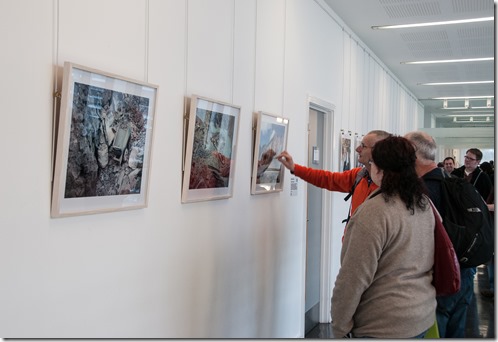
I felt that the text about her subject matter didn’t really follow on to the images on display. I couldn’t see any reference to the issues of consumerism and waste in today’s society. What were shown were various views of covered landfill sites, mainly without a point of focus, other than the post production colour effects. Without the pink sky and / or blue earth the images would have been even flatter and have had little impact. I’m all for post-production processing, but I think the processing technique should be used to enhance an image, not be the main feature of it.
The display wasn’t good either – there were varying sizes of images and frames which didn’t help the continuity and presenting them on a staircase meant that they were easily walked past, or viewers were causing holdups on the stairs. I’m sorry Ms. McNally but the earth didn’t move for me!
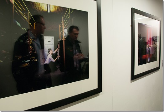
Still in QUAD we looked at ‘Fight or Flight’ by Tim George.
These ‘high contrast, high impact’ images depicting stress at work were obviously set-up shots with excellent use of lighting. The large glossy prints were well mounted and displayed in simple black frames.
It’s a shame, when everything has been done correctly with the production and presentation of these photographs, that they were displayed in a narrow corridor where viewers were pushed on top of the pictures and so couldn’t really appreciate them.
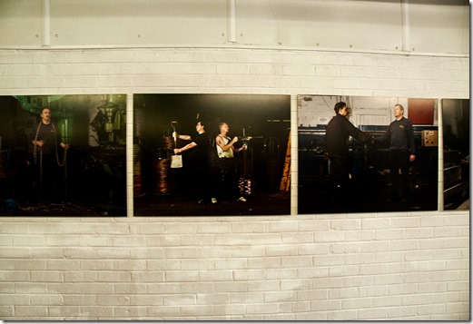
Moving on to the Chocolate Factory, we looked at the work of Chris Coekin in his ‘The Altogether’ installation.
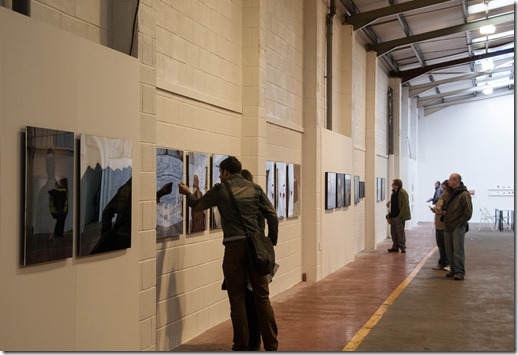
The setting for this display couldn’t have been better. The posed images of workers (now redundant) in their factory, well presented on thick laminate without frames, sat so well in another redundant factory. The music / sounds coming from two ‘Dansette’ type record players enhanced the feeling of ‘things past’
The images themselves were almost comical, with the workers holding unnatural poses, some with equipment in unusual positions. I think it would be hard to find an outlet for this type of imagery, except maybe in commemorative calendars etc.
It has to be said that the images left a lasting impression, so they obviously worked!
Finally in the Chocolate Factory we considered two photographers with displays on opposite walls of the main factory building:
David Chancellor’s display ‘Pelepele’ documents the South African workers in a sustainable tree farming industry. His large, bright images make the scenes look very appealing. The workers are posed and happy looking. Everything’s just fine here – there’s nothing untoward going on and that’s the way it’s to be portrayed!
Ian Teh’s display ‘Dark Clouds’ shows the Chinese industrial landscape with its attendant health and safety issues.
The way this display is presented makes the viewer sit up and take notice. Some of them are out of focus; some are really ‘artistic’; some are shrouded in steam and smoke; some have extreme post-production colour treatments; the size of the frames varies to maintain interest. All these different aspects may have caused the display to have been fragmented, but the real feeling which has gone into this presentation, the humanity which is felt in the images and the strong message that runs through it made the exhibition really cohesive.
The intention of the photographer was being explored here – if a display is to work, the photographer needs to think about: What is the intention of the presentation? What is the message that is being put across? These will be a useful things to remember when I get round to Part 3 of this course, but to a degree it’ll have an impact on all my future assignments.
So that was a really useful, really enjoyable study day. Good to be able to voice an opinion and meet tutors and fellow students - and it didn’t snow too hard on the way home either! Thanks OCA.
No comments:
Post a Comment